Maturity
FYQ2 target
Overview
Types
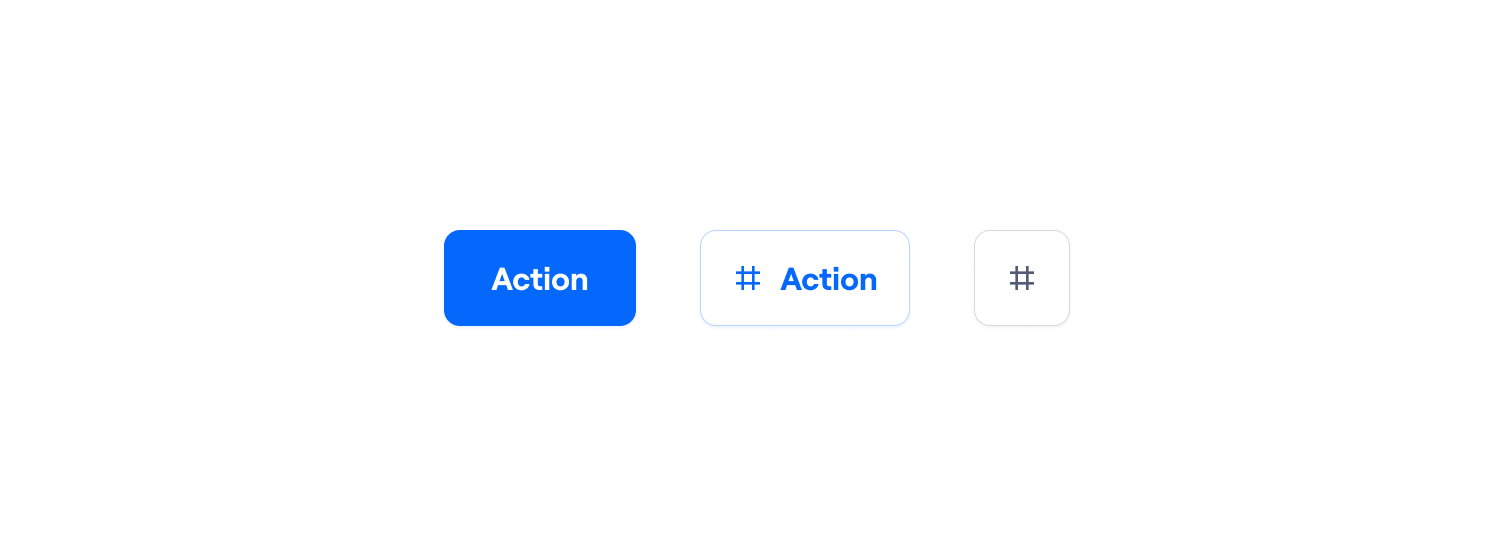
There are two different types of Button components depending on their purpose. Each has different hierarchy levels, properties, elements, and uses. Here is a summary:
|
Name |
Emphasis |
When to use |
Preview |
|---|---|---|---|
|
Secondary |
Most actions |

One or many, inline with the content |
|
|
|
Tertiary |
Low emphasis actions: (More) Actions menu toggle |
|
|
Primary |
The next best action: Move forward or finish a main flow (One per region max.) |

One or two, at the end of the region |
|
|
|
Tertiary |
Dismissive actions: 1. Cancel
2. Skip |
|
Buttons vs. links
The standard rationale for when to use buttons or links is: A button does something; a link goes somewhere. However, we want to remain flexible.
In certain circumstances, the Action Button or CTA Button can be used as hyperlinks to content on other pages or websites. This means it has the look of feel of an Action Button or CTA Button but works like a link. For instance, if the link performs an action, like updating a user’s data, saving some edited content, or deep-linking to a dialog, it makes sense to have the button as a link.
To do this, either pass a href prop to a Button directly and it will work as a link and allow for any props that an <a> should allow for:
Or if you are using a framework like NextJS, wrap the button with the NextJS Link:
Further reading
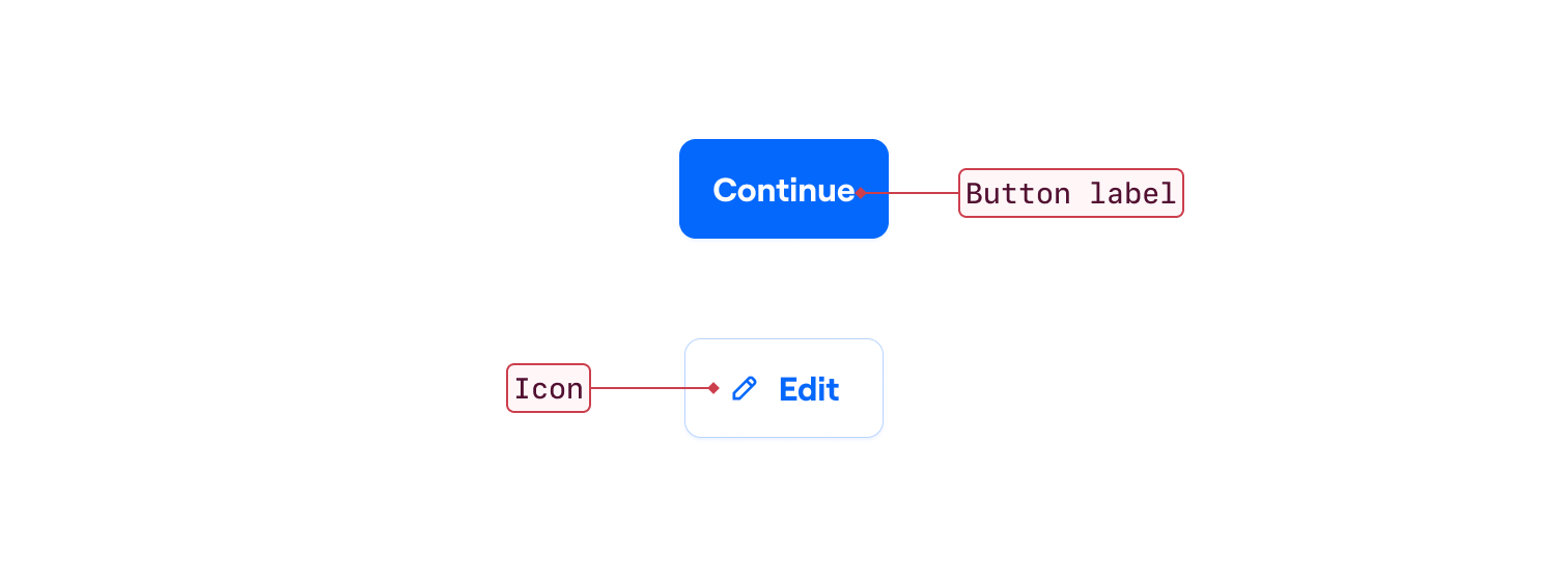
Anatomy
Properties
The following properties are jointly defined by design, engineering, and UX writing to speak a common language:
|
Name |
Values |
Default |
|---|---|---|
|
Size Visual size of the Button |
SM MD |
SM |
|
Destructive Signifies this action will cause data loss and can’t be undone |
Boolean |
False |
|
Emphasis The hierarchy level that defines its visual prominence |
Primary (CTA Button) Secondary (Action Button) Tertiary |
Primary (CTA Button) Secondary (Action Button) |
|
Disabled Disables interaction and focus and signifies it |
Boolean |
False |
|
Waiting Signifies the action is taking place and can not be interacted with until it finishes |
Boolean |
False |
|
Icon Only (Action Button) Hides the text label from the button. It will be displayed as a tooltip on hover/focus |
Boolean |
False |
How to use
Hierarchy
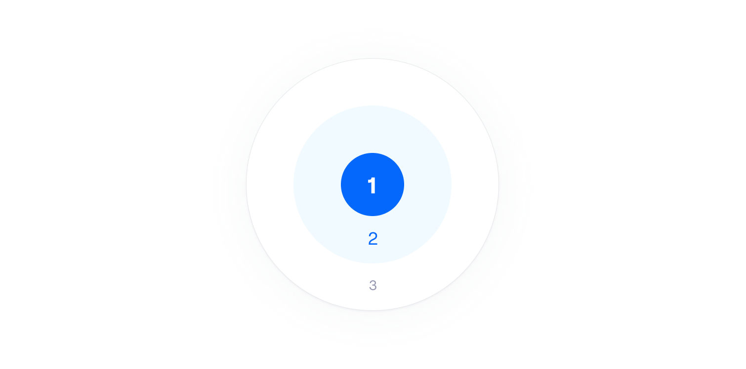
We have created a holistic emphasis system to create focus and hierarchy in our designs. We use visual properties such as color, size, space, and alignment. But there must be a direct relationship between the visible and the semantics to guarantee a good experience. Our system uses purpose as the cornerstone of our visual decisions.
Related content
Destructive variant
Destructive actions permanently cause data loss. Because they can’t be undone, they will always require user confirmation. They are available on both components using the Destructive property.
Button Label
The goal of a Button Label is to clearly communicate the action taken by a person. It should be predictable, explicit, consistent, and scannable.
Related content
Clarity and conciseness
Write maximizing meaning with minimum wordiness. Be mindful of the space and the impact in translations.
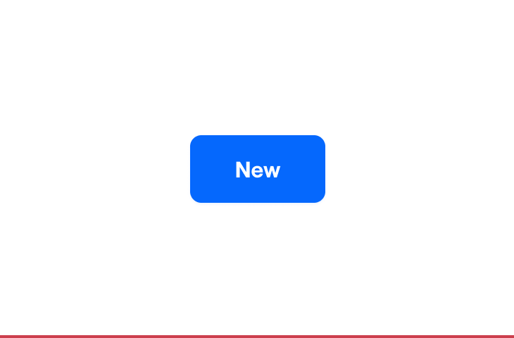
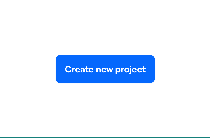
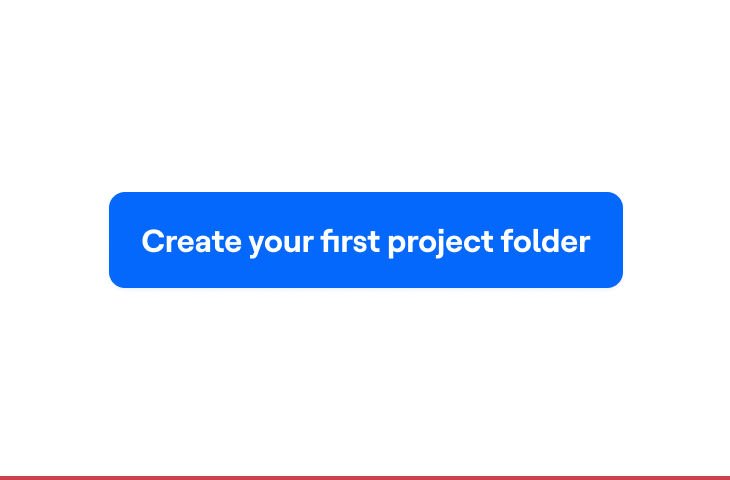
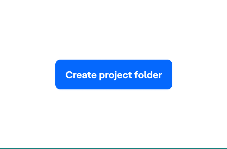
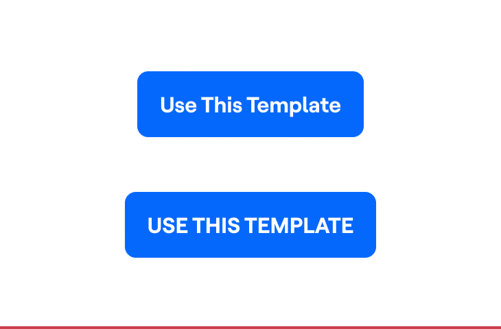
Capitalization
Overdoing labels is unnatural and more difficult to understand for everyone.

Accessibility and inclusion
Always recognize diversity in individuals’ needs and abilities, being self-aware of biases.
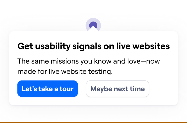
Conversational Labels
Labels should be practical rather than engaging.
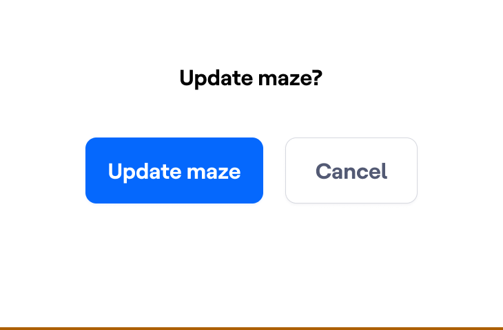
Most common Button Labels
|
Add |
Use add when a person puts an object in a new place or experience (for example, a prototype) and when they add objects one by one or in bulk (cards, blocks, etc.). → See also: Create, Invite |
|---|---|
|
Apply |
Immediately puts changes into effect without closing the window, for example, when using filters. |
|
Cancel |
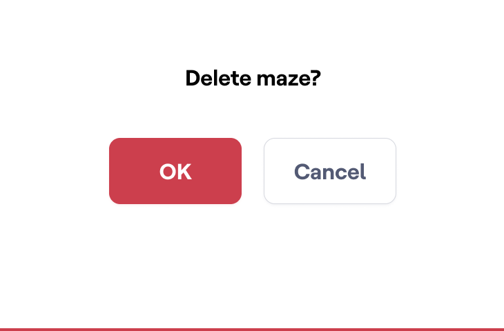
Use when a person decides to undo an action. Don’t use undo. |
|
Create |
Use it when a person is about to make something new from scratch, especially when it’s a multi-step process, such as creating a maze or a project. Avoid using New, especially when it’s not accompanied by a noun. → See also: Add |
|
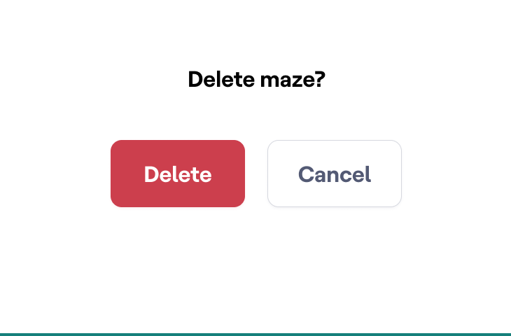
Delete |
Removes objects so they’re no longer available and can’t be restored. Don’t use in relation to people, for example, delete participant or delete user. In cases like that, it’s better to change the perspective to avoid the dehumanizing tone (delete profile, delete user data, etc). |
|
Get started |
Avoid. Get started is generic and ambiguous. Choose a more explicit button label. |
|
Go to |
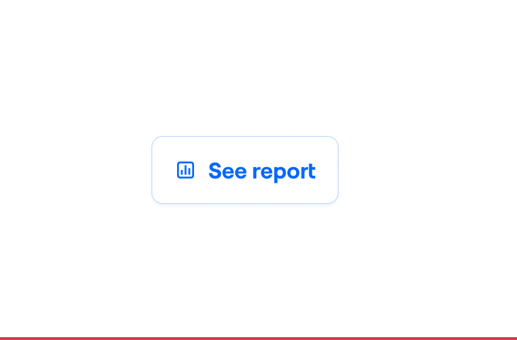
Directs people to a particular place (for example, Go to Reach). When directing to the homepage, use Return instead. When referring to objects, use verbs (for example, write View report instead of Go to report). |
|
Invite |
Use invite when people want others to join Maze as it feels more human and conversational. Avoid using add. |
|
OK, Done, Got it |
Whenever possible, use context-specific, explicit labels led with verbs. Don’t use OK it as a label when informing about maintenance breaks or new features, and when explaining how things work. Use Got it instead. Don’t use OK or Done as a label when a person is about to confirm changes made. Use Save instead. |
|
Remove |
To remove something means we take away an object from the context or experience. The object isn’t deleted—it still exists. For example, we remove team members from a team. → See also: Delete |
|
Save as |
Use Save as when creating a new object from existing content or data, for example a segment created based on applied filters, or a template based on maze. → See also: Create |
Further reading
Arrangement
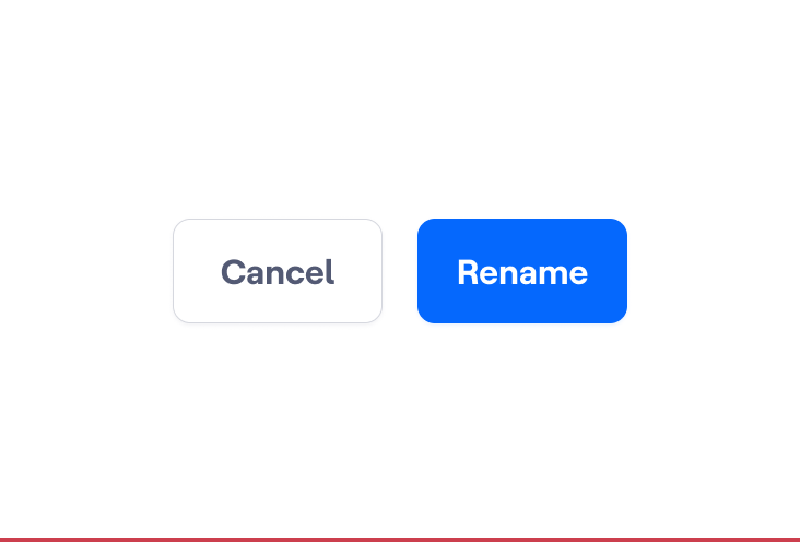
Typically, we use the F pattern to arrange our buttons.
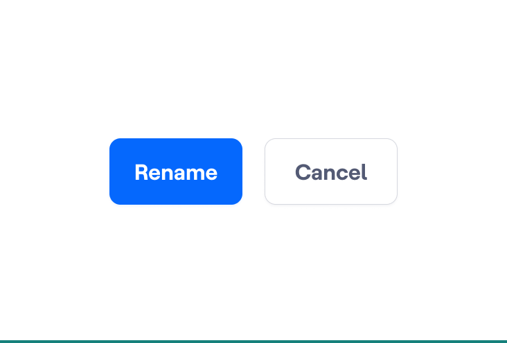
Sizing and Spacing
We use standard sizing and spacing for all interactive controls to improve the experience depending on the information density and make our interface more accessible, predictable, and easy to use.
Related content
Width

The width of our Buttons is intrinsic, which means that the Button doesn't stretch to fit the width of its container. The width depends on the length of the Button Label, plus the Icon—if present—plus the padding on either side of the Button. In Figma, this is called Hug contents in auto layout.
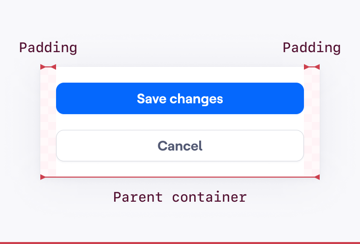
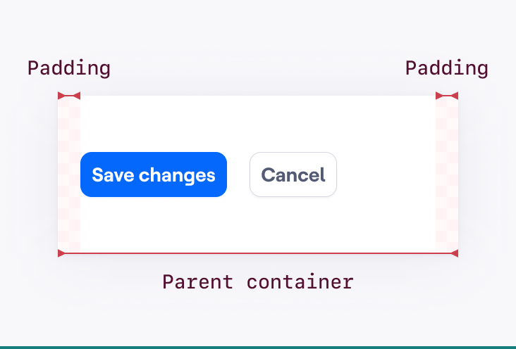

We have defined a min-width to ensure our Buttons have a generous and accessible target size regardless of the Button label's length.
Behavior
States
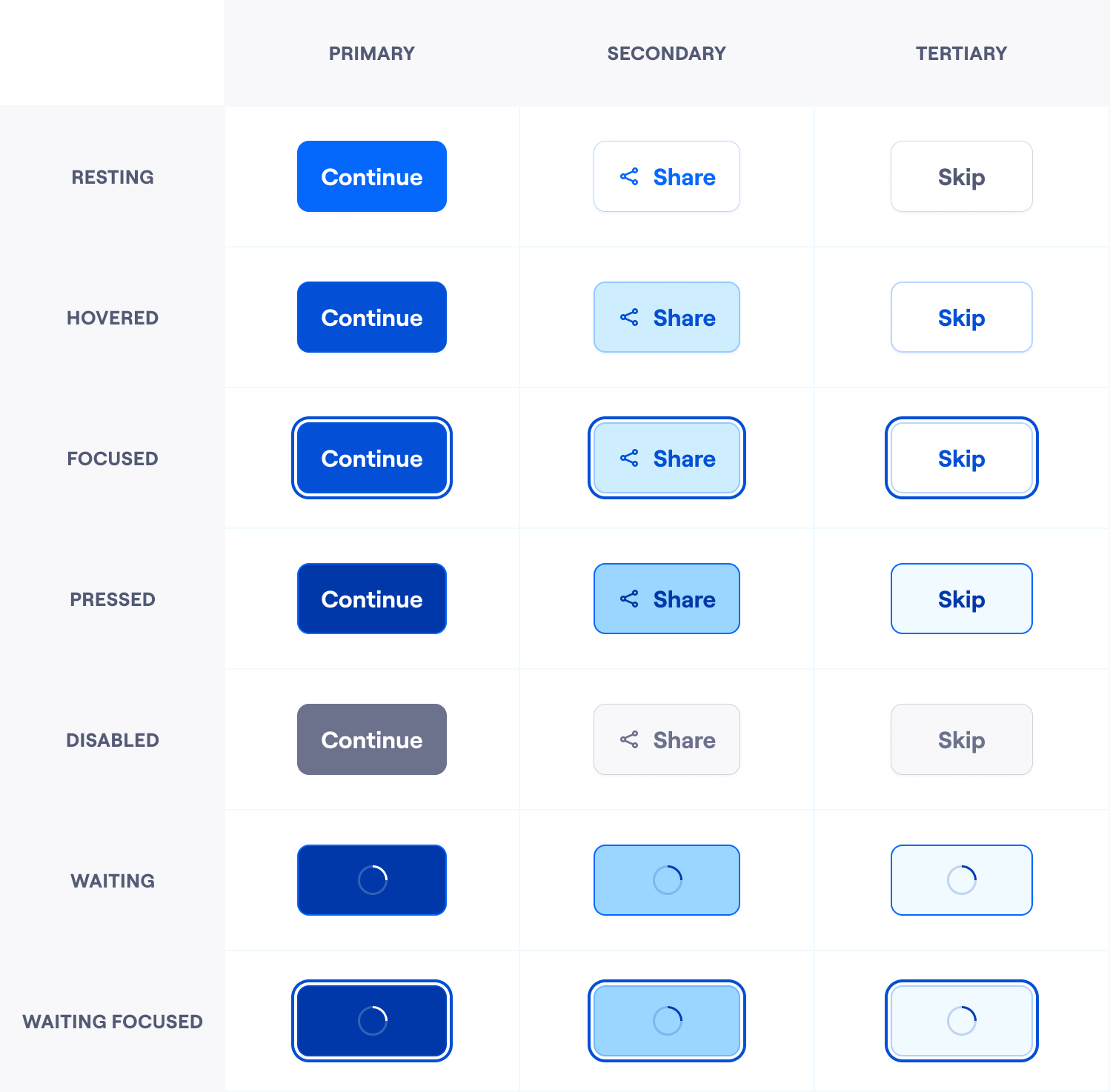
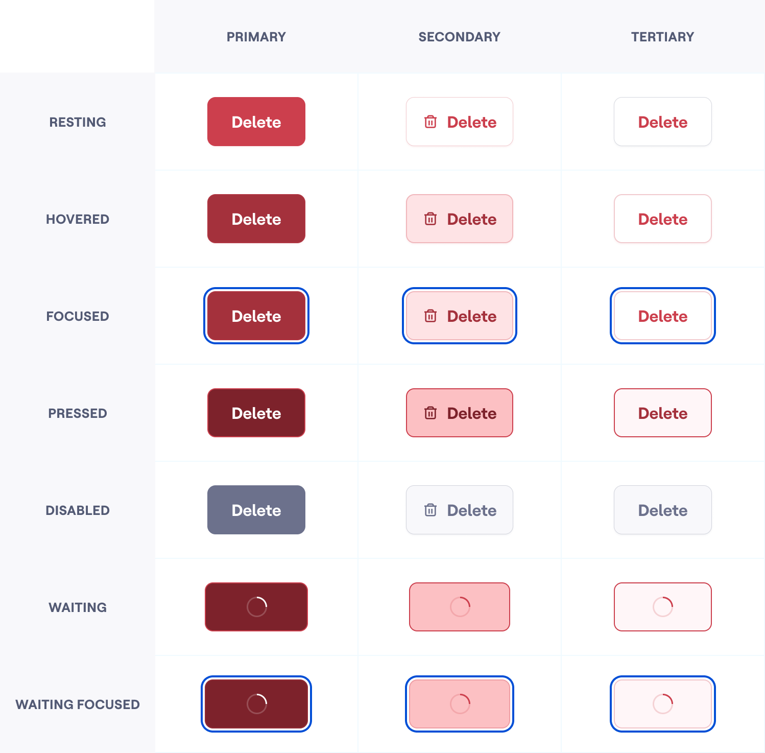
The state of a component can depend on properties set before people can interact with it. We call them state properties. Differentiating them from the user-triggered states allows us to combine them, creating richer states that cover the whole interaction spectrum.
Related content
Default variants
Destructive variants
Disabled Buttons considerations
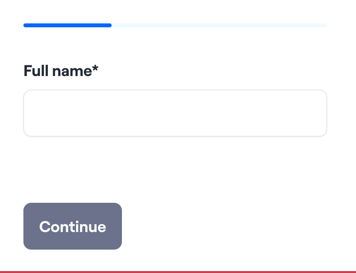
There may be good reasons for disabling Buttons. Sometimes we want to make it harder for our users to make mistakes and avoid unnecessary layout jumps between error messages. Or sometimes, we want to point out something important is missing before moving on to the next step.
But disabled buttons only communicate that something is wrong; they don't explain why. As a result, many users—especially non-tech-savvy ones—often get stuck wondering what's missing or what they've done wrong and end up frustrated. We are not helping them fix the problem and move forward, which should be our priority.
They also pose various accessibility problems. The most important one is that disabled buttons are usually not focusable and, therefore, cannot be accessed by users with a keyboard.
Recommendations
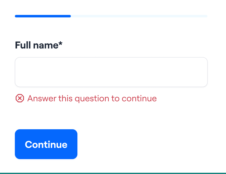
By default, show the Resting button; if the person presses it and there are remaining actions to perform, provide them with a meaningful in-context error message. This will remove complexity and avoid confusing people for unknown reasons.
Related content
Sometimes, people don't have permission to perform an action. In those cases, instead of showing a disabled button, consider hiding the action itself. Components have specific variants that provide more meaningful context.
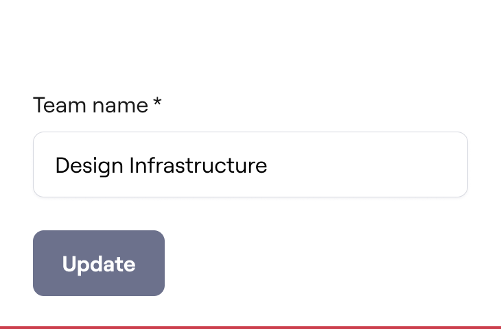

When people need to perform other out-of-context actions or tasks to unlock an essential one, disabled buttons can be helpful. In these cases, ensure you provide enough context to unlock this action.
Responsive considerations
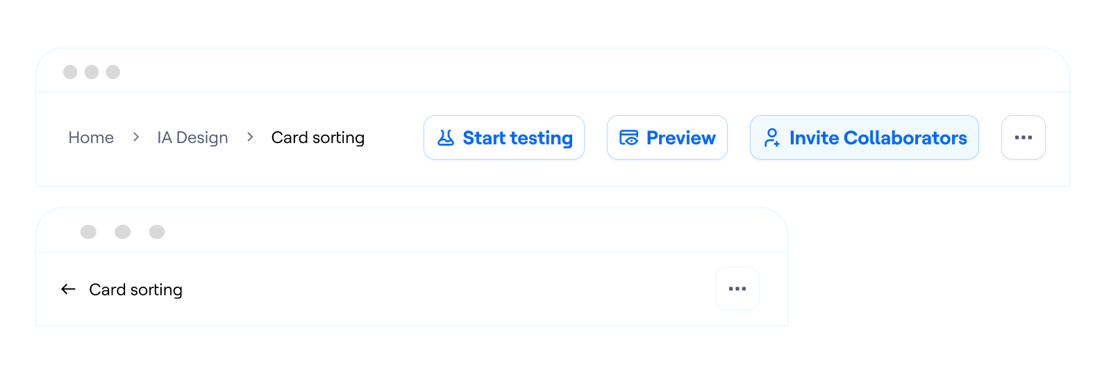
When a group of actions is displayed horizontally, the buttons will take the available container space. If the container gets smaller, the buttons will progressively conceal under a “More options” Tertiary button.
Acknowledgements
- “Next Best Action” — a simple way to ensure user engagement, by H Locke
- Uber Base: Buttons, by Uber design
- Frustrating Design Patterns: Disabled Buttons, by Vitaly Friedman